Lessons in Urban Planning from Disney
I come from a Disney family. Yea, one of those families. The road trip down to LA once a year type family. I remember not being able to sleep the night before because I was so excited. I’ve grown a little bit now, to the point where I hesitate before buying the four-dollar churro, but Disney still inspires me.
Just now it isn’t the rides or the food, but the atmosphere Disney Imagineers have created throughout the parks. There is a sense of contentment walking through New Orlean’s square or a feeling of excitement in Adventureland that you don’t get in most cities. It's the same feeling that people get exploring the canals of Venice, or boulevards of Paris and I think the main reason why Americans shell out 200 bucks a day to visit Disneyland.
What are the characteristics that make these cities so appealing, and how did Disney capture them so well? Early in March, Disney put out a documentary called The Imagineering Story, which detailed the history of the Imagineers, the people who design Disney parks. As I was watching, I started to notice similarities between the design rules that Disney used and principles in urban planning. Principles that are best exemplified in these special cities like Amsterdam or Paris. These are the Disney design rules that are seen in the great cities in the world and should be used in all of them.
1. Attention to Detail/Pretty
The first thing one sees after walking into Disneyland is a giant Mickey head created out of hundreds of flowers, always perfectly in bloom. As you walk through the park, it is rare to see any sort of litter, and any exceptions are immediately swept up by Disney’s army of cast members. Everything, from the manhole covers to the water bottles, proudly display the iconic silhouette of Mickey Mouse.
Disney was one of the first companies to understand that it's the details, even the ones that you don’t notice, that make the experience. A Harvard Business Review said that Disney “nailed attention to detail well before Apple,”(hbr.org, 2012) a company that has built its reputation off that principle. In the line for Indiana Jones, guests pass the time by attempting to translate the indigenous language Imagineers created for the temple. In Frontierland, hoof prints and wagon lines imprinted into the specially-designed concrete gives the impression that a covered wagon just passed by. In Tomorrowland, all the plant life is edible, an example of what modern farming could look like in the future. These extra details are what sets Disneyland apart from the competition and make the park that much more pleasant to visit. You don’t see this at Seaworld.
These details are usually glossed over during city budget meetings. Why would a city spend extra money on hiring an extra garbage truck to maintain cleanliness standards or increasing the budget on a freeway overpass and turn it into an art piece? In that same vein, why should I, a taxpayer, have to pay extra just for a couple extra sculptures in the park. I don’t even go to the park! (It's a long walk)
The thing is, attention to detail is what makes a place special and beautiful. The potted plants by the front door, the noticeably litter-free downtown with the cool new art piece in the middle. The prettier a place, the more likely the people who inhabit that place are going to take ownership of it and take better care of the said place, and the less the city is going to have to pay in upkeep in the future. Imagine if our freeway overpasses looked like old Roman aqueducts instead of the ugly concrete monstrosities they are now. Any sort of vandalization would be the scandal of the town.


A modern freeway overpass versus an old Roman Aqueduct. Which would you like more in your backyard? Which would you spend more effort maintaining?
2. Blend of Old and New
But what makes a place attractive? Isn’t beauty subjective?
Science says otherwise, at least to a point. There is this concept called the creative curve that author Allen Garnet popularized in his book by the same name that explains the human preference for creative ideas. This curve is based on the principle that humans like things that are a combination of familiarity and novelty.
Let me explain. When our ancestors were hunter-gatherers and spent their days looking for food, they would often find plants and animals that they had never seen before. Let's say one of them, named Darryl, found a berry that nobody had seen before. Darryl would be more likely to try it if it had similar characteristics of a berry he already knew was safe. His first desire is to be safe, eating something he is pretty sure is edible, but it is also balanced by his desire for something new and the added benefit that might have. If this berry is edible, that's an additional food source for Darryl.
We don’t need to taste test berries anymore (the Darryls of the world have already done that for us) but if you look at the globalized world now, a lot of the creative ideas that have gone mainstream make use of this creative curve. Viral songs remix beats and samples from the past. Each age of painting adds its own twist to the one before.
Steve Jobs, who knew a thing or two about design, made use of this principle with Apple products. Originally, the iPhone was going to have straight edges instead of rounded corners. Steve took the designer out into San Francisco and pointed out every street sign and traffic light he could until the designer relented. One of the reasons Jobs thinks the iMac sold so well was because of the calligraphy he insisted be a part of the word processor. All of these are familiar things people knew and understood which gave people the courage to try these products that had never been seen before. If they looked too unfamiliar, people would have balked.
The creative curve is seen all over Disneyland Park. Main Street is a blast of nostalgia and familiarity with its typical small-town American design, but the street frames a fantastical castle in the distance. In the new Star Wars land, designers were tasked with creating an entirely new world never before seen in the films. To make this alien world seem familiar, the architects and artists drew inspiration from iconic architecture in cities such as Jerusalem, Instanbul, and multiple cities in Morocco.
3. Constantly Evolving

The Haunted Mansion decorated for Christmas.
The problem with the creative curve, however, is that once an idea or concept becomes too familiar, people start to lose interest. There is no longer that novelty factor that keeps us interested. Even iPhones lose their luster after a few months of use and a brand new model hovering over the horizon.
Disney solves this problem by constantly evolving. Walt himself had the quote, “Disneyland will never be finished. It will continue to grow as long as there is imagination left in the world” Every Halloween and Christmas, Disneyland completely redecorates and changes the storylines of some of its rides like Haunted Mansion and Its a Small World. Pirates of the Caribbean, Indiana Jones, and Star Tours have all seen upgrades in the last few years that improved the ride’s props, animatronics, and or completely revamped the story of the entire ride. In California Adventure, the last 10 years or so have seen the complete overhaul of its main street entrance, the retheming of Pixar Pier, and the addition of Cars Land. In a couple of years, an entirely new land will open up where the Bugs life area used to be, and it goes without saying that Disney has many plans already in the works for future changes and upgrades.
Every time a new skyscraper is added to the San Franciscan skyline I always want to visit, but it is important to note that change has consequences; consequences I do not have to deal with as someone who lives outside the city. With every change, both in cities and theme parks, the entire system is going to be affected. New apartment buildings and office complexes bring extra traffic and congestion to the city and could change housing prices to the point of gentrification. New lands in Disneyland and California Adventure increased the crowd size almost to unbearable sizes and took away from the rest of the park. When the new Star Wars land opened in Disneyland, the lines there were over two hours in length, while the rest of the park sat damn near empty.
So while it is important to keep evolving as a place, great care has to be made in the decisions to change. Theme parks don’t have to worry about gentrification or construction annoying the neighbors, cities need to. While the San Franciscan skyline has grown, gentrification has spread throughout the entire region as housing prices shot up to insane levels. While our NBA team the Warriors moved into a brand new arena downtown, our public transportation system is largely the same it’s been for 50 years. These housing and transportation problems might be a good place to start.
4. Enclosed
There is only one spot in all of Disneyland where one can see the outside world; the very top of the Matterhorn, and even then you only get glimpses. The real world is scary, and humans don’t like being in wide open spaces. It is a habit leftover from our less civilized ancestors who over thousands of years figured that being out in the open meant that you were exposed to all the scary cats and crocodiles that could eat us. Instead, we associated safety with enclosures, walls that keep out anything that might want to eat me for a light snack.
This works up to an extent, as once buildings become too tall they start to become overbearing and not a little bit scary, especially in earthquake-prone California. I remember driving through San Francisco as a child and gazing almost directly up at the 70 plus story Bank of America building and imagining just how bad of a day I would have if an earthquake decided to happen exactly at that moment. Contrast cities like San Francisco, Chicago, and New York with that of Paris, Barcelona, and Amsterdam. Walking through those streets bring about the safe feeling of enclosure all without blocking out the sun with an 85-story monstrosity of glass and steel.

What walking down the street looks like in New York City

Walking down the street in Amsterdam.
At Disney every single building is at most three stories, providing this gentle density that we crave while not blotting out the sun. In addition to this, natural-looking barriers block our view from other lands and the outside world, keeping our focus in our current environment without distracting our brain with things that don’t belong. Think of the way the desert wall of Cars Land gently wraps around the town of Radiator Springs, or how walking through New Orleans Square, one would have no idea of the existence of the alien environment of Star Wars land that sits just over the hill. Tom Sawyer’s island would look weird with the Millenium Falcon in the background of the Temple of Indiana Jones with New Orleans square.

This artificial topography wraps around Cars Land and obstructs the view of Anaheim city behind it and Pixar Pier to its right.
5. Weenie
The Weenie is one of Disney’s greatest tools, even if also one of their biggest failures in naming. A weenie is a landmark or objects the provides orientation around a given area. Cinderella’s Castle is one. The Matterhorn replica could be another. In California, the Ferris Wheel works just as well. Easily recognizable and distinct, usually due to their looming size, spotting a weenie will immediately tell the observer where they are in relation to the weenie, and therefore where they are in the park/city. It's like a compass, just larger.
A great example from an urban environment would be the Duomo in Florence. While I was a student there, most of our directions revolved around the Duomo. The book shop is just three blocks past the Duomo. That cafe is a block past the Duomo to the right. If you were lost, all you needed to do was find the Duomo spire in the sky and you knew exactly where you were. (This is an added benefit of gentle density with few story buildings. It would be hard to spot the duomo if it was surrounded by skyscrapers.)
College campuses have similar tools. The Campanile at UC Berkeley is a good one, it can be spotted by a lost freshman from pretty much anywhere on campus. Up in Spokane at my own college Gonzaga, St. Aloysius church does a great job as well. If by some chance I was stumbling around lost in the neighborhood surrounding the college, all I need to do is find one of its spires in the sky and I know exactly where I am.

Note how the Duomo stands tall over the rest of the Florentine skyline.
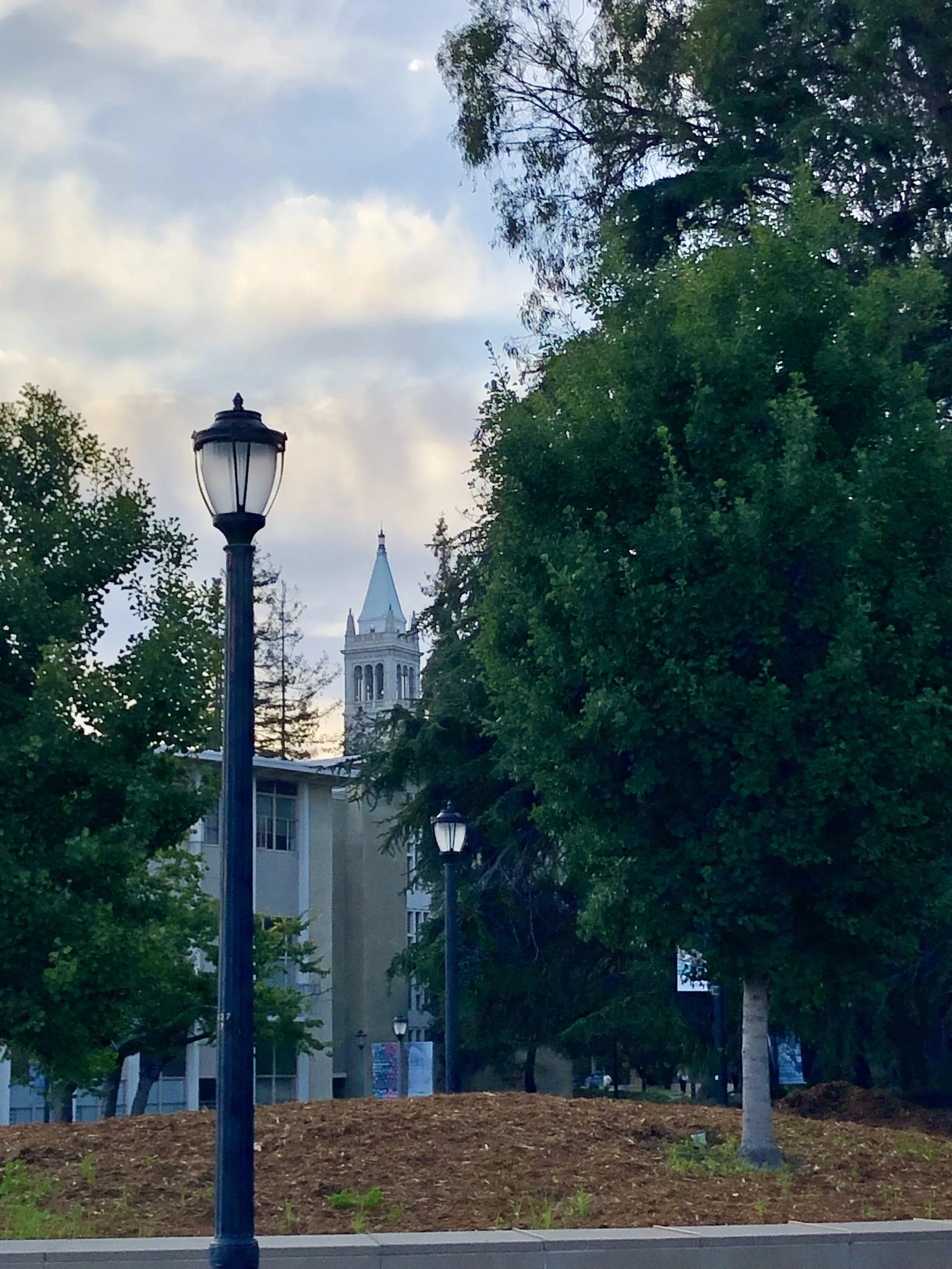
The Campanile at UC Berkeley
You can fault Disney with a lot of issues; their near-monopoly over entertainment, its poor treatment of workers, its prices, (4.75 for a churro should be a capital offense) but one thing that you cannot take away from them is that they make damn good theme parks. The reason they were able to do this, by following these five main design rules, rules that they derived from the world's greatest cities.
If you would like to learn more about what makes a city great, I definitely would recommend this video made by the School of Life. There are many more principles that go into making cities great, principles I didn’t include because they were either not important enough to mention or not applicable to theme parks and therefore Disney. (Or because I was lazy, you decide.)
All of these rules, like all good things in our world, require money, something cities always seem to be lacking. In my next article, I will outline some interesting ideas from the book, The New Localism, that might be able to help in that aspect. That can be found here, once it's finished.
Photo Credit
Cover photo by Jonathan Körner
Overpass photo by Aaron Munoz
Aqueduct photo by Sébastien Jermer
Haunted Mansion photo by Ben Lei
New York Street by Brandon Green
Amsterdam Street by Vinícius Henrique
Carsland photo by
Florence Picture by Gonzaga University
Campanile photo by me (Can’t you tell?)